Building a playful brand universe for childhood exploration
A brand built to celebrate the imagination, playfulness and creativity of childhood
Bellita was created to build a brand experience that celebrates the imagination, playfulness and creativity of childhood. The project drew inspiration from the narrative and illustrative world of How to Catch a Star by Oliver Jeffers — a story that conveys curiosity, adventure and a poetic perspective on the world.
From this reference, I developed a visual identity that combines handcrafted illustrations, tactile materials and graphic elements that evoke the spontaneity of children’s creative expression. My role spanned the brand concept, brand experience, visual direction, illustration system, textile patterns and a range of applications across physical and communication touchpoints.

& Experience Design
Oliver Jeffers
- Logo design
- Brand concept development
- Touchpoint design
- Visual identity, tone of voice & art direction
- Communication strategy & visual guidelines
- Textile pattern design from original illustrations
- Packaging design
- Customer experience design
Built around play, handmade expression, fun and material exploration
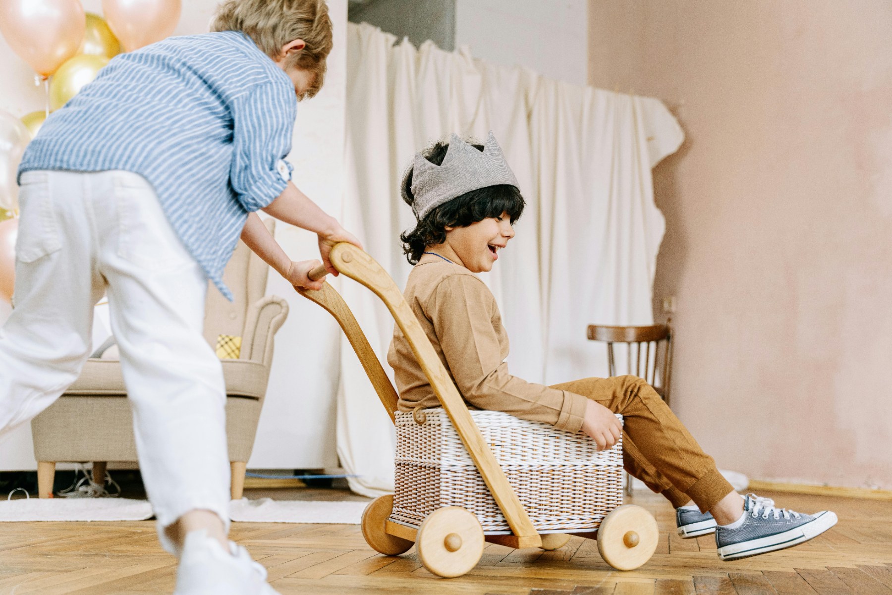
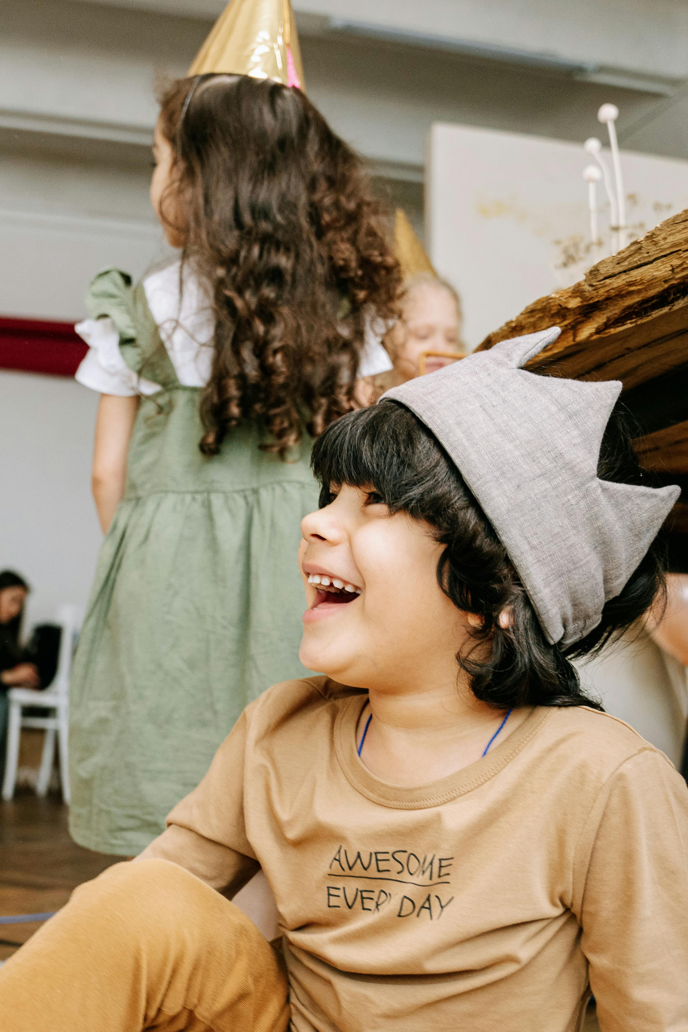
By observing how children naturally explore the world — drawing, inventing stories, mixing materials and playing without rigid rules — an opportunity emerged to create a brand that celebrates imagination and hands-on creativity as essential parts of childhood.
The intention was to move away from highly digital or standardized children’s brands, and instead create a universe that feels closer to the creative processes children engage with every day: drawing, painting, cutting, building and experimenting with their hands.
Every element of the brand was designed to convey the sense of discovery, imperfection and freedom that characterizes spontaneous play.
The identity was built around four central ideas
Play
Curiosity as a driver of exploration and learning.
Handmade Expression
The authenticity of imperfect marks and creations made by hand.
Fun
The ability to surprise, imagine and invent new stories.
Materiality
The richness of physical materials, textures and handcrafted processes.
A wordmark that writes like a child
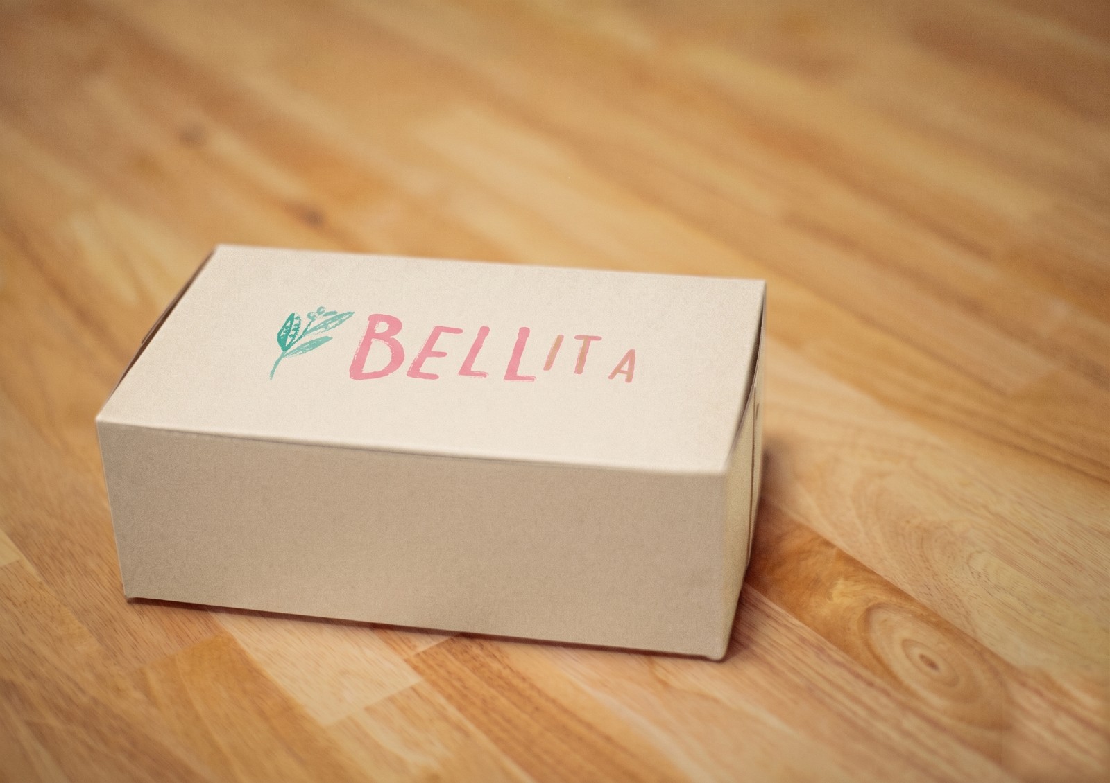
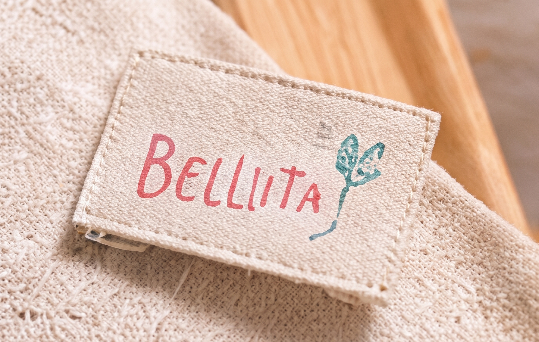
The logo was inspired by the way children write — recreating the feel of marks made with crayons and chalk. A handwritten-style wordmark was paired with textured illustrations, visible brushstrokes and handcrafted finishes. Together, these elements help create a brand that feels approachable, warm and genuine.
Materiality at the center — texture, color and the tactile pleasure of making by hand.
A visual universe of paper boats, stars, kites and small explorers
An illustrated world
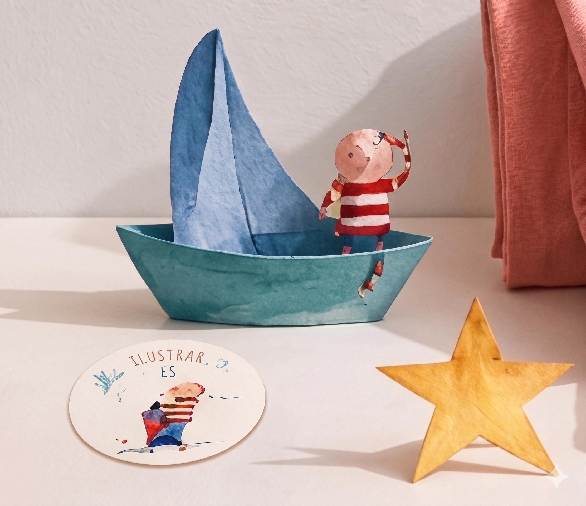
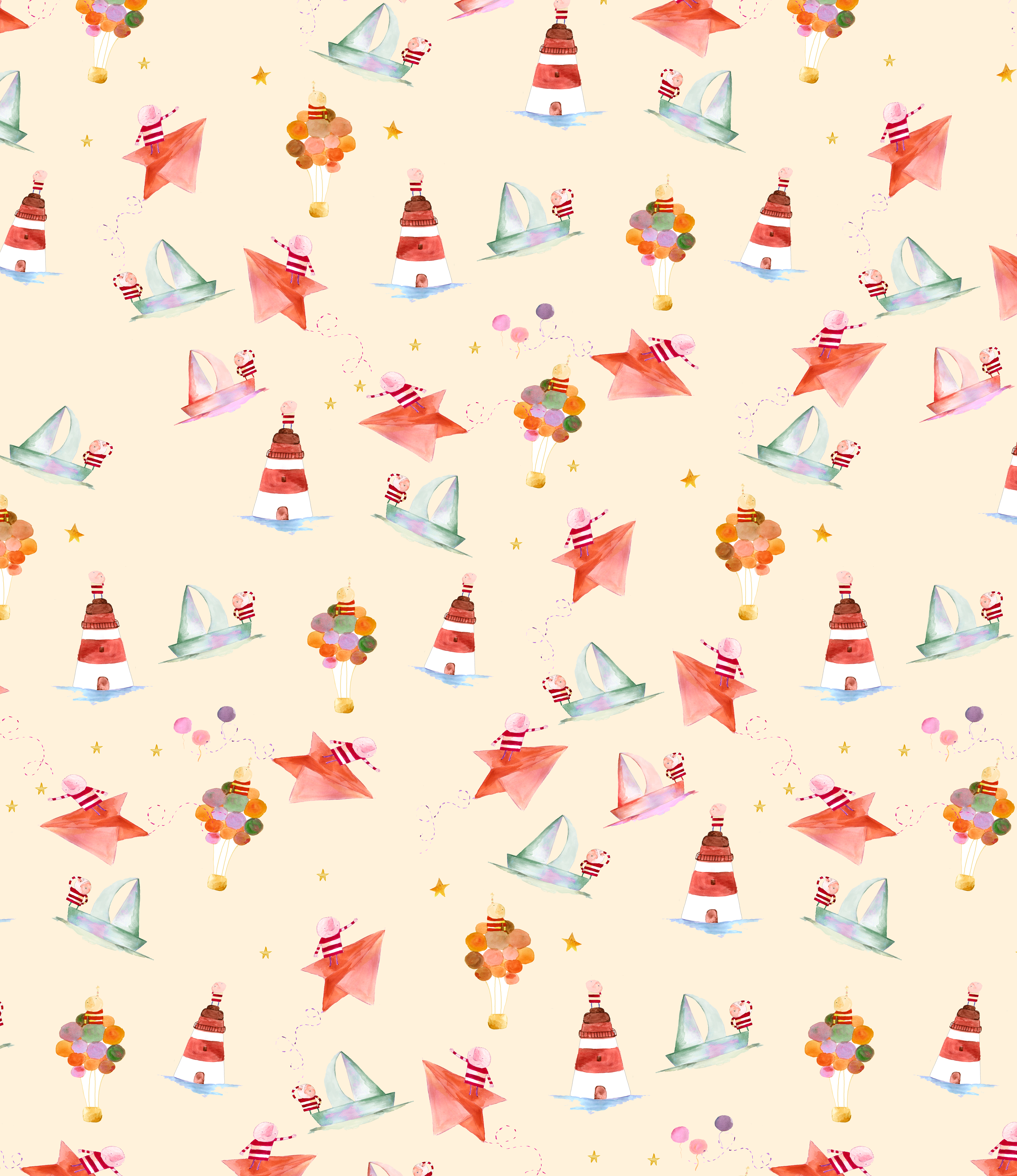
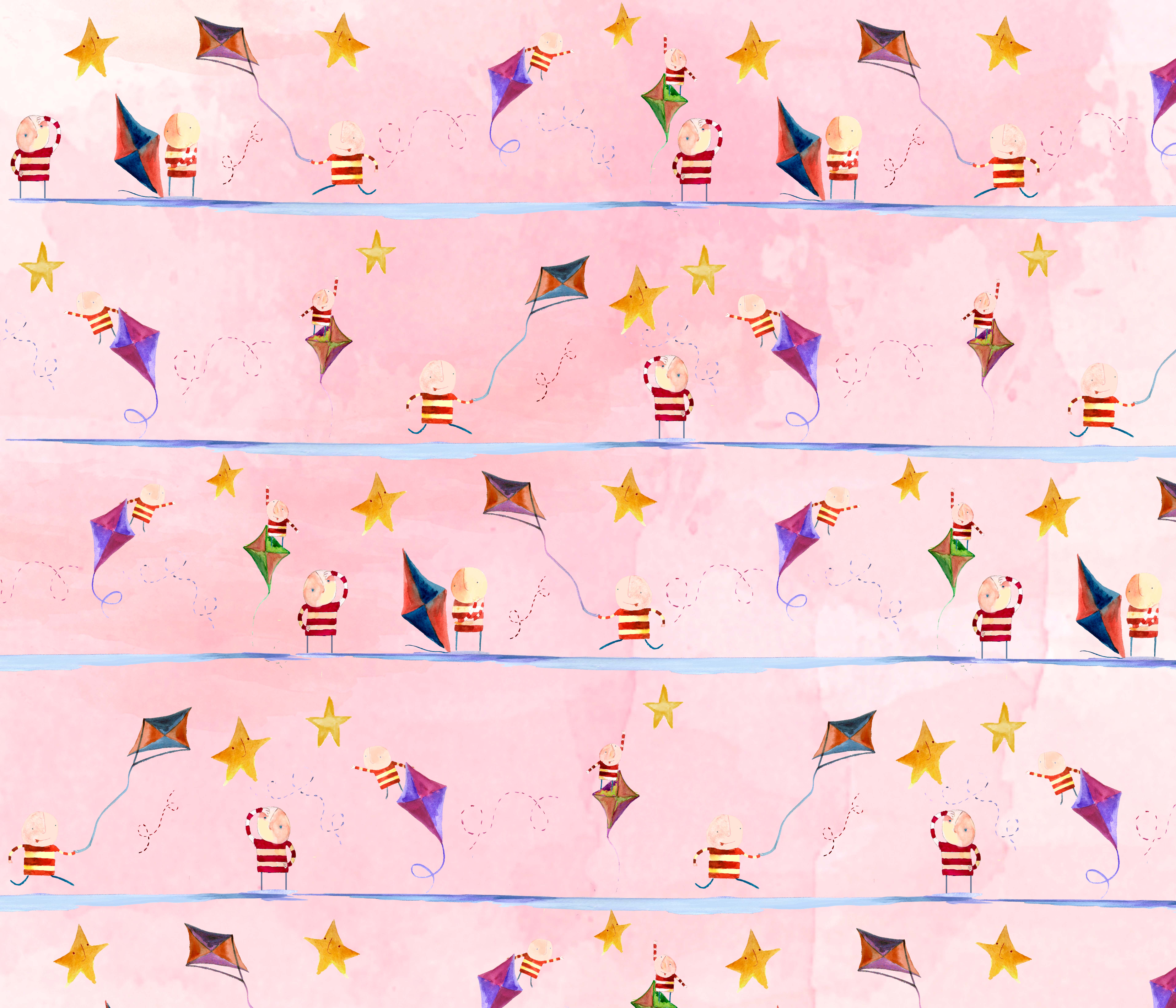
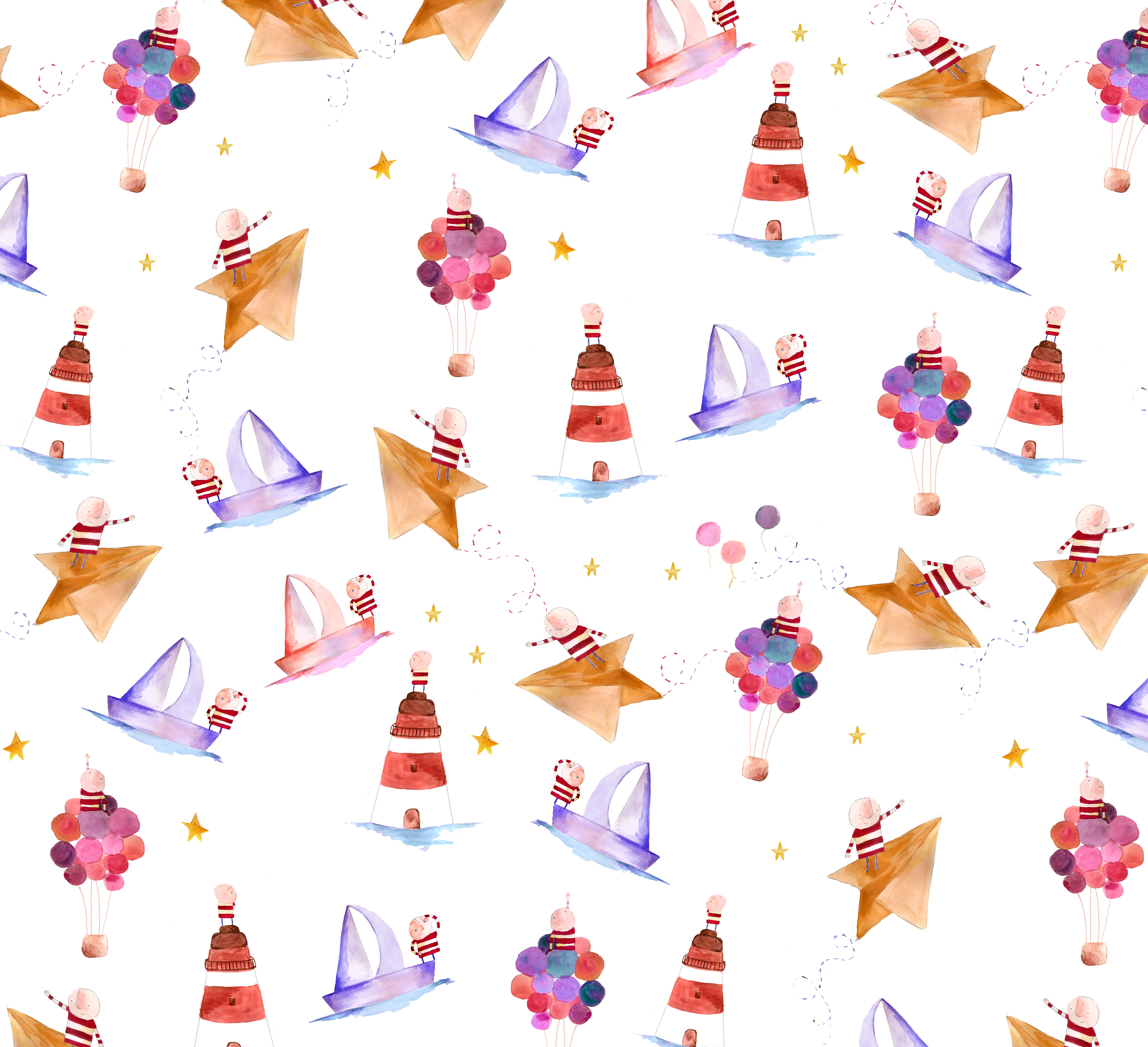
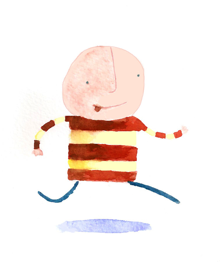
Inspired by the watercolor aesthetic and storytelling style of Oliver Jeffers, I developed a series of characters, objects and environments that form the visual universe of the brand. Paper boats, stars, kites, lighthouses and small explorers appear throughout the illustrations, reinforcing ideas of adventure, imagination and discovery.
From drawing to pattern
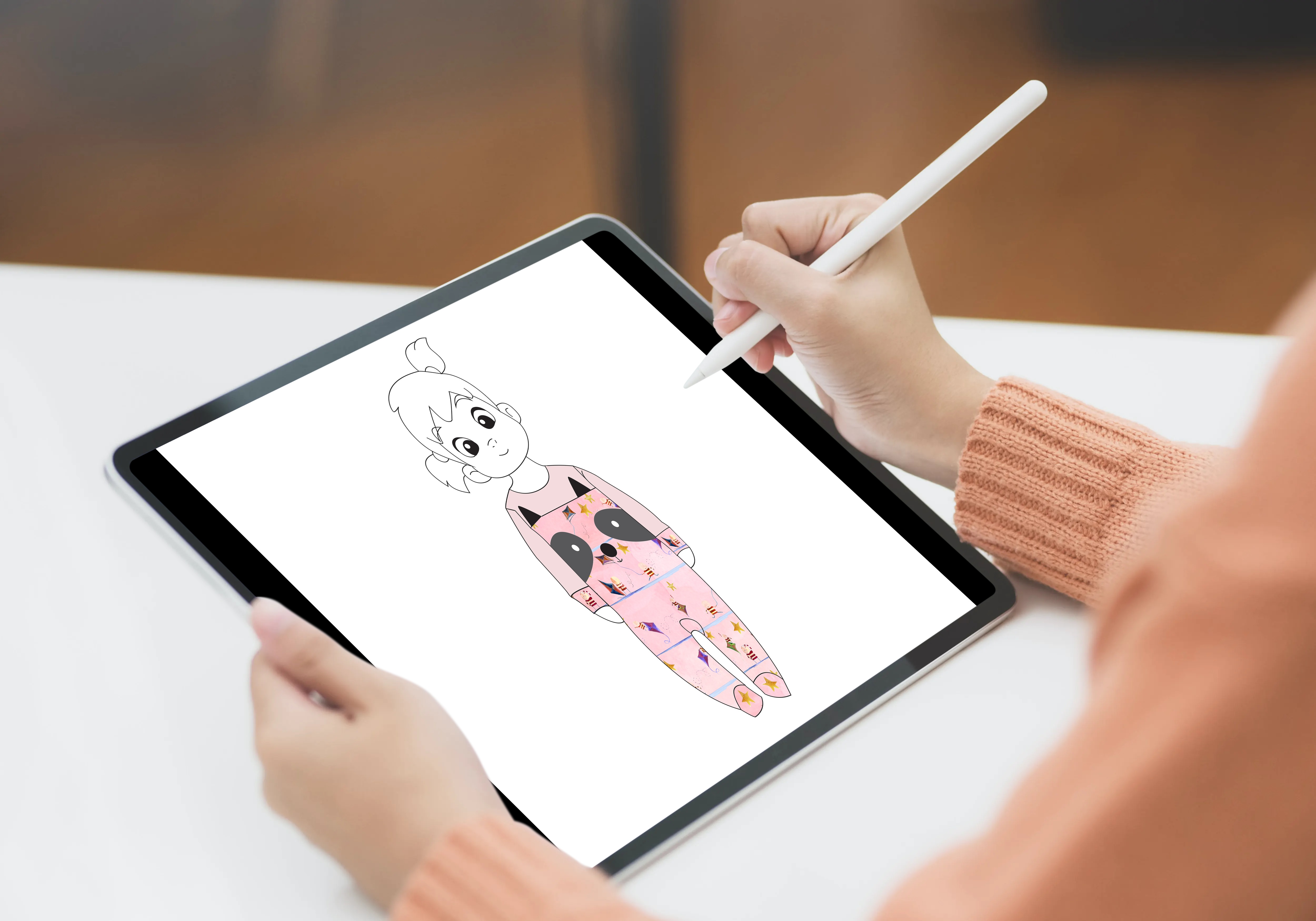
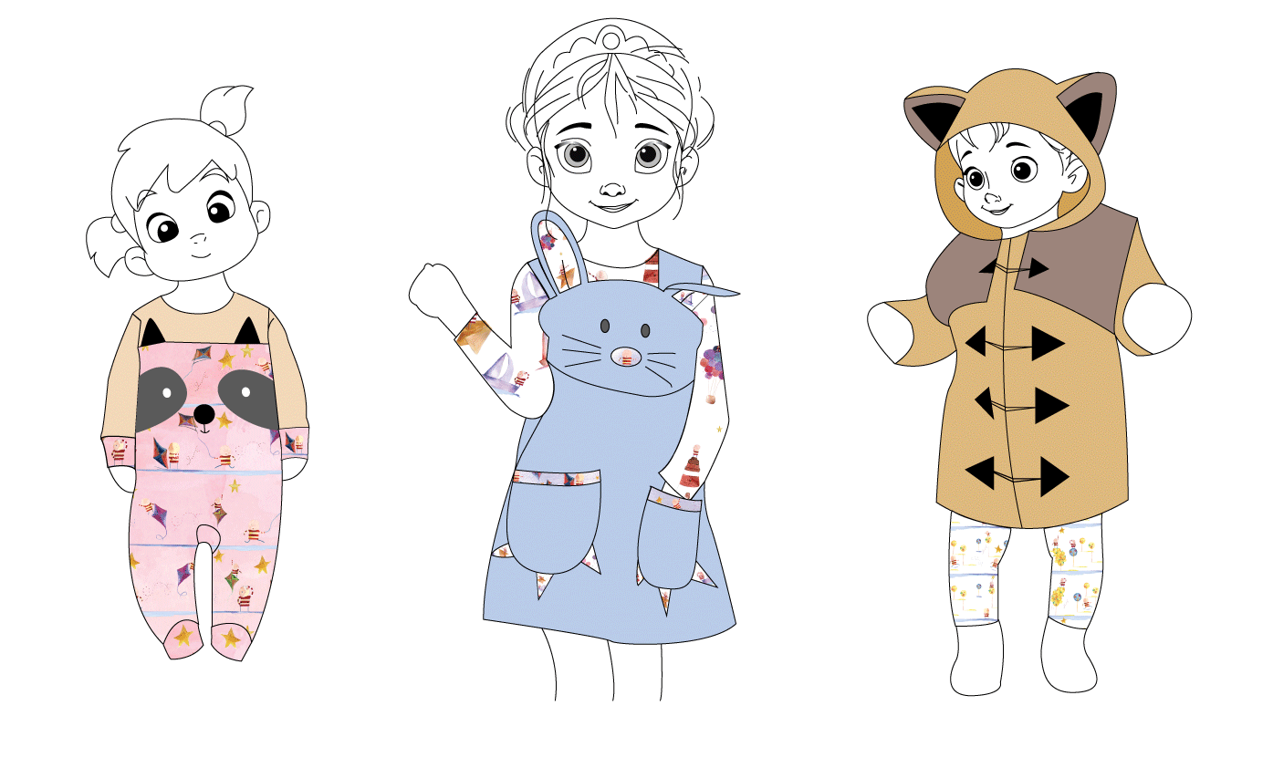
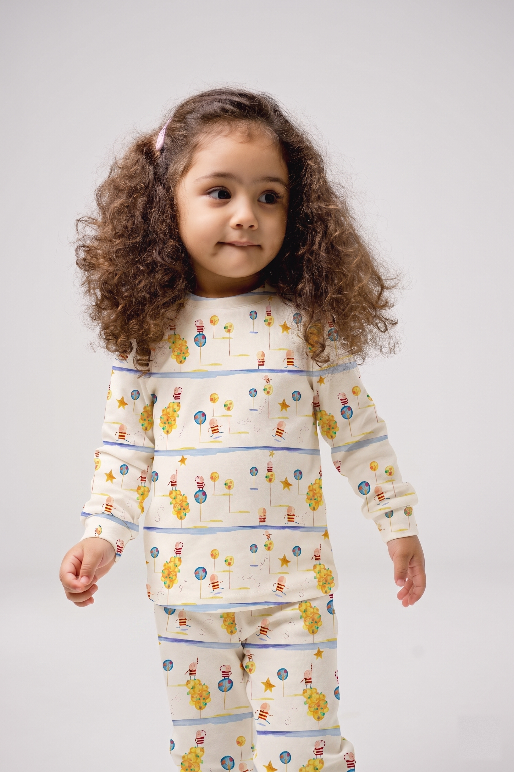
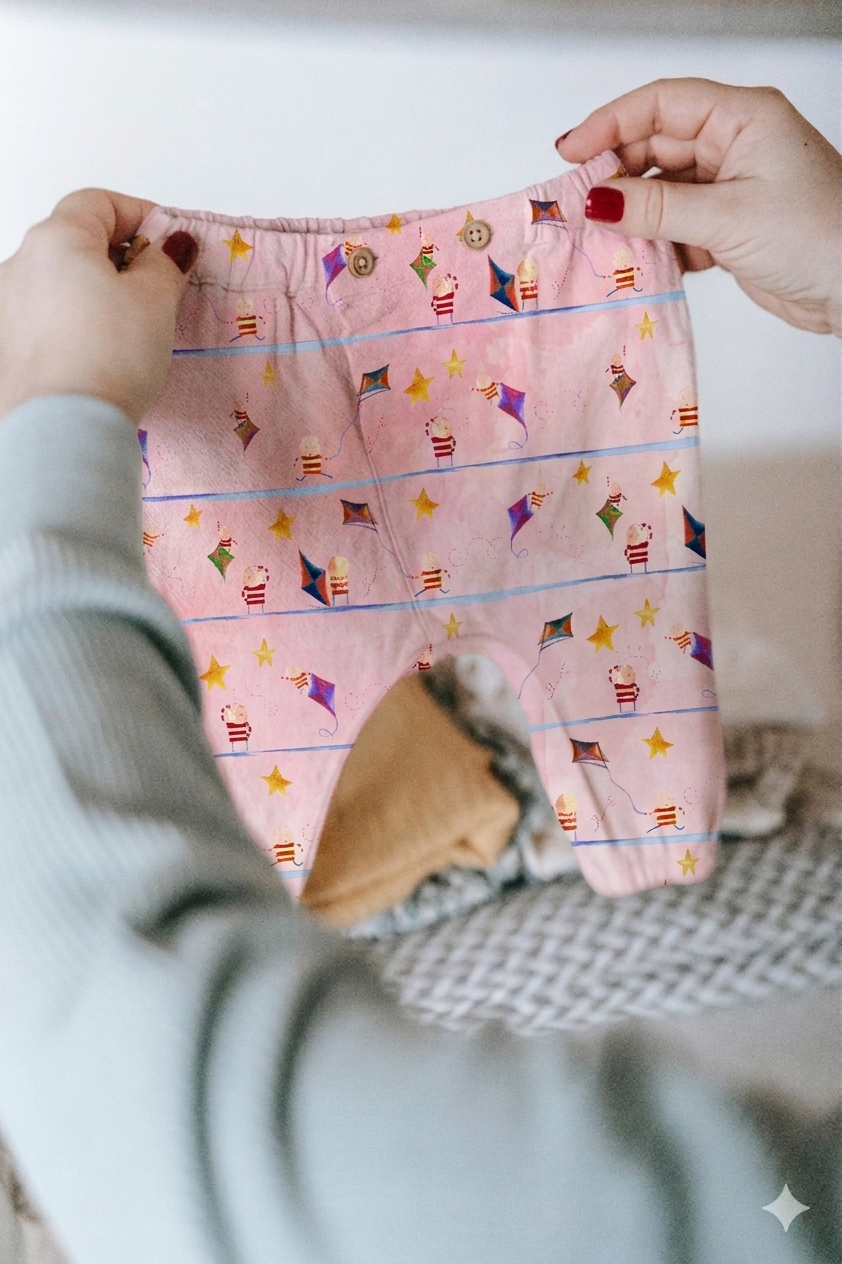
This system was translated into a collection of textile patterns applied across garments, creating a recognizable identity that could adapt across multiple products — while intentionally preserving the freshness and authenticity of hand-drawn illustration.
From illustration to object
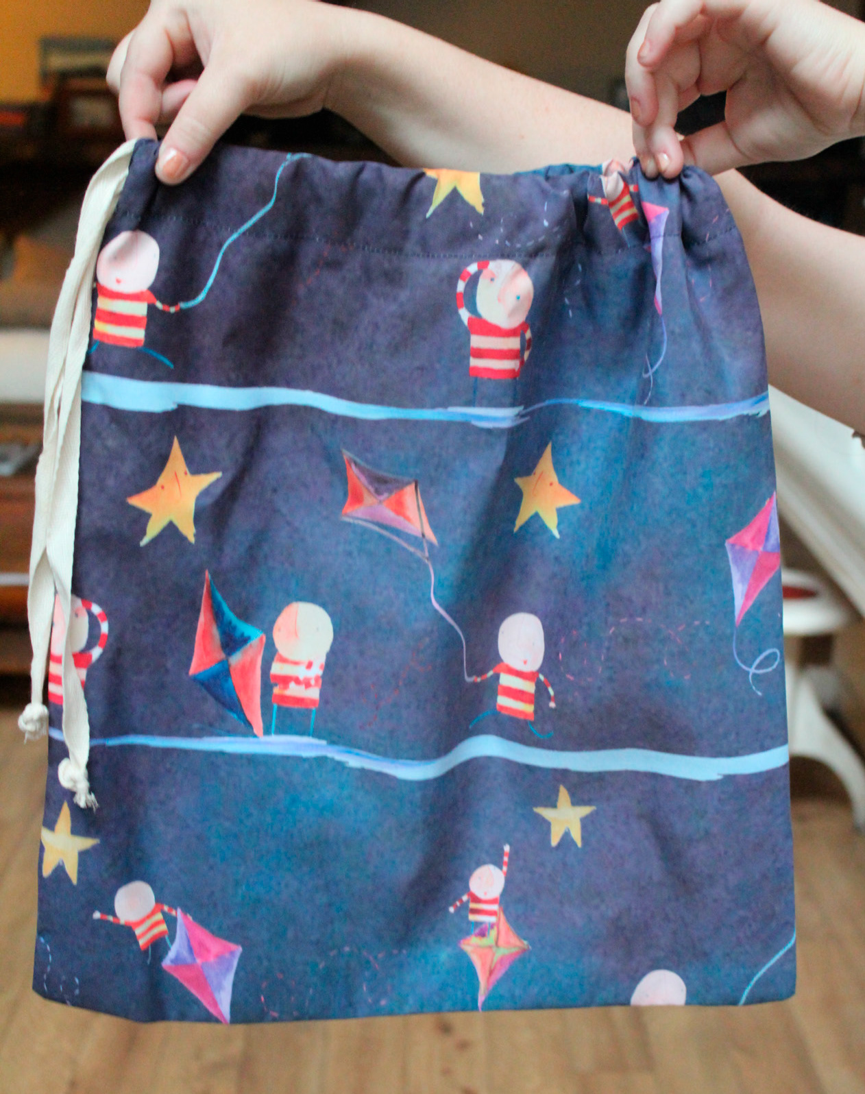
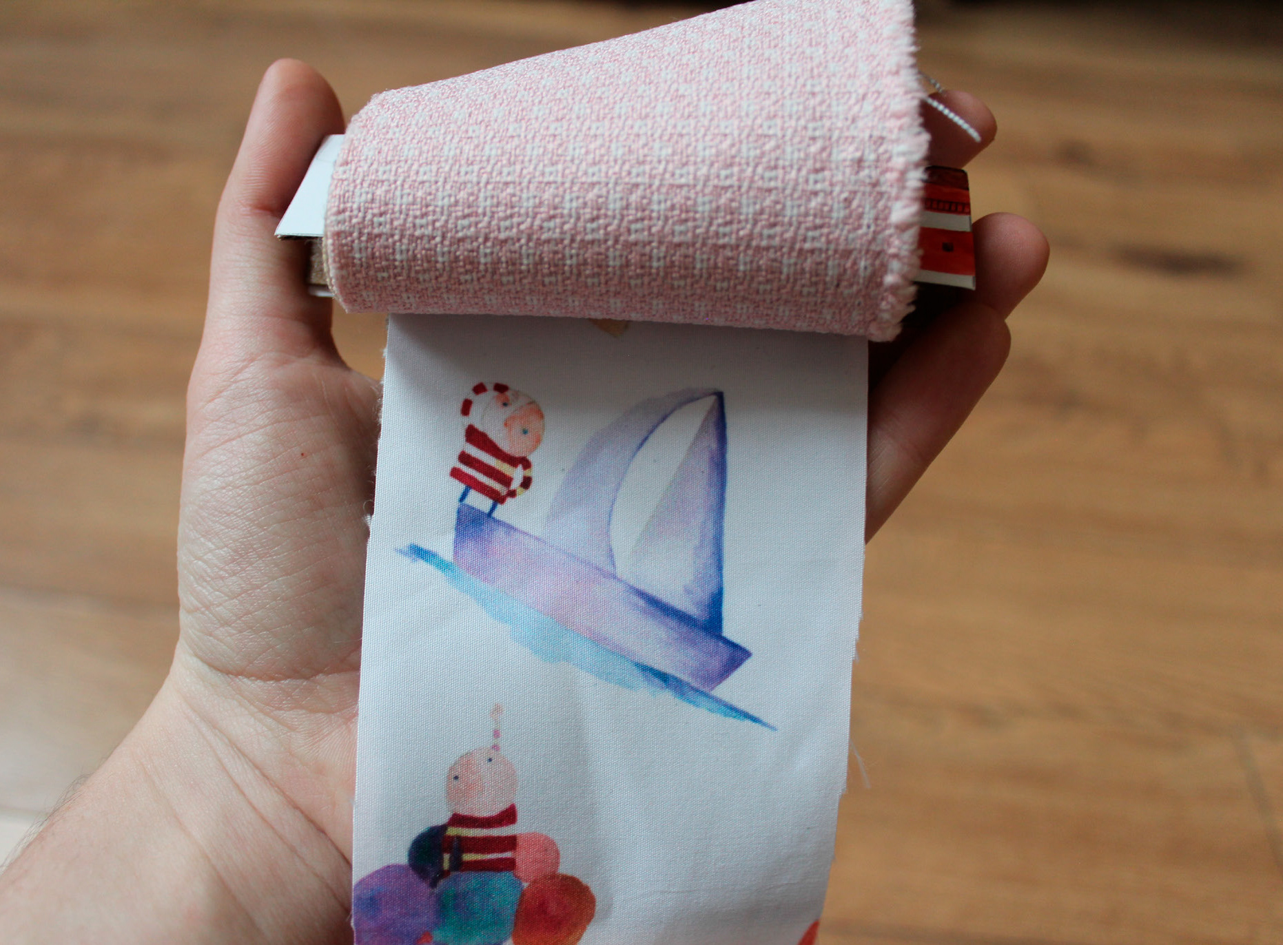
Patterns, garments and textiles brought the illustrated universe into the physical world — translating drawings into something children could wear, hold and play with.
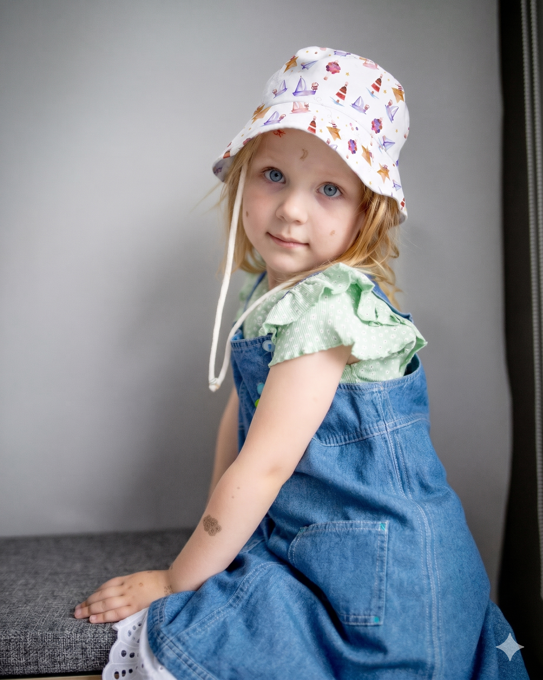
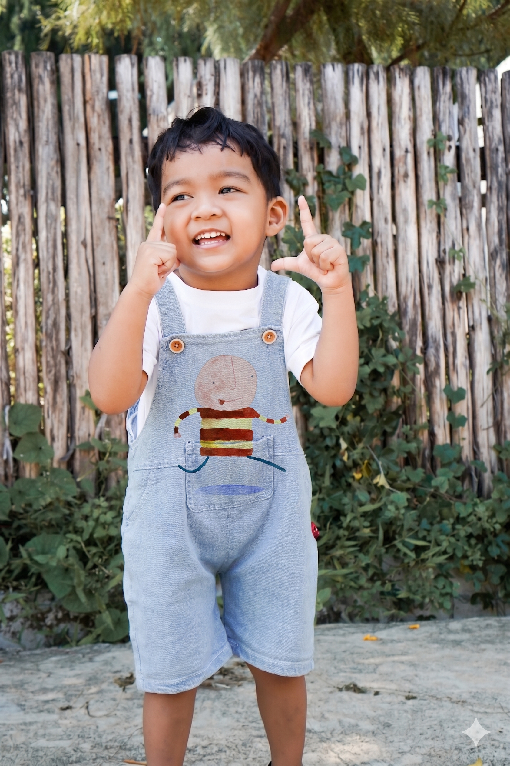
Imagery and composition that keep play at the center
The communication system followed the same principles through imagery and compositions that reinforce the themes of imagination, play and exploration.
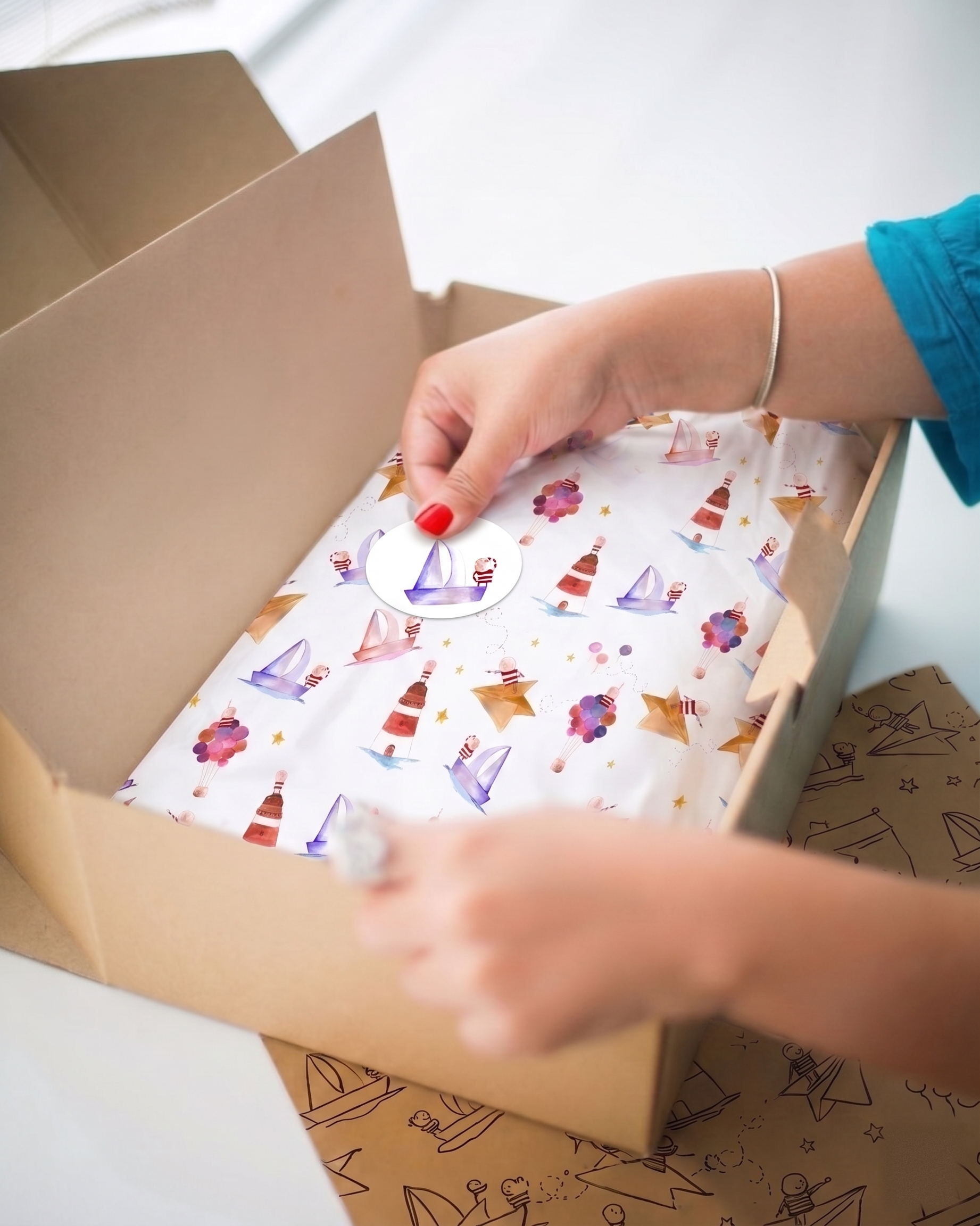
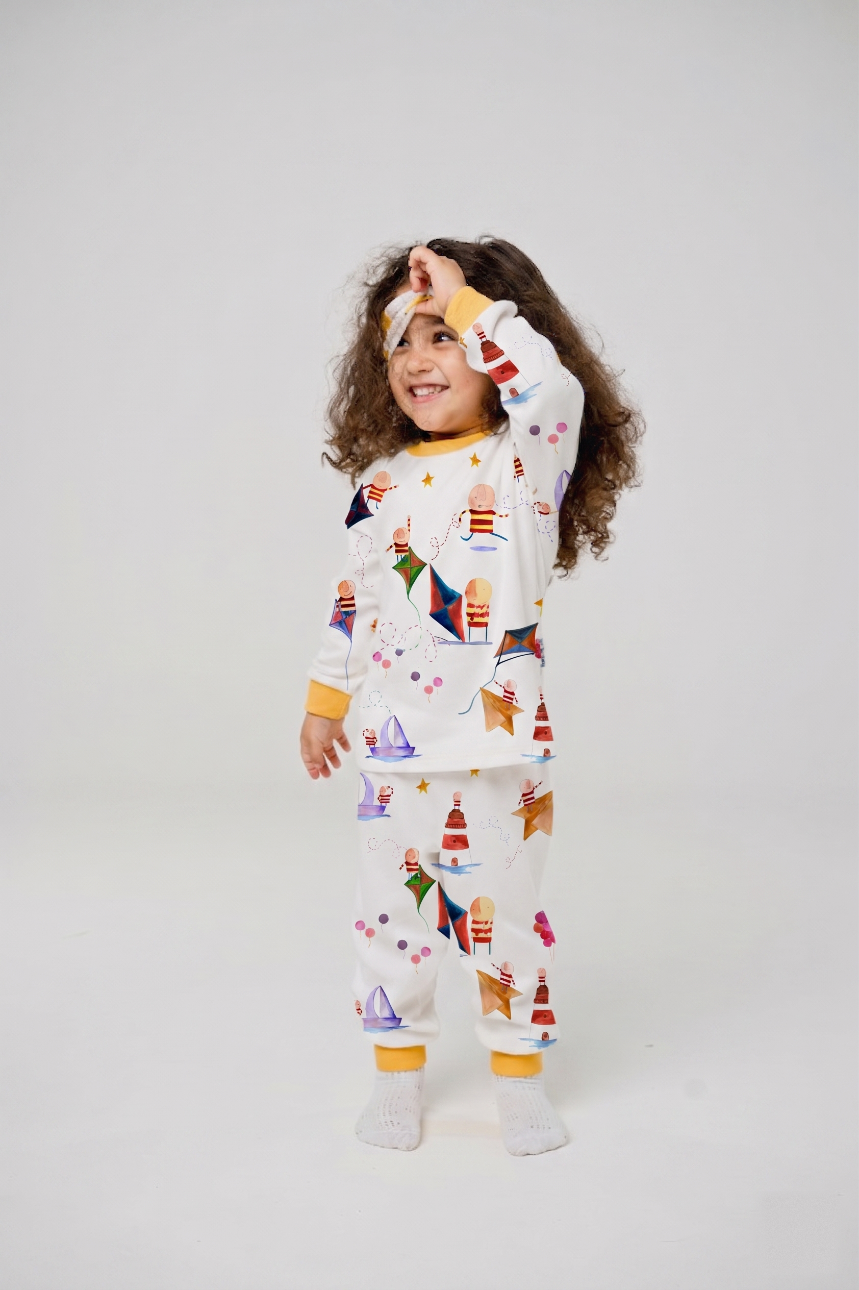
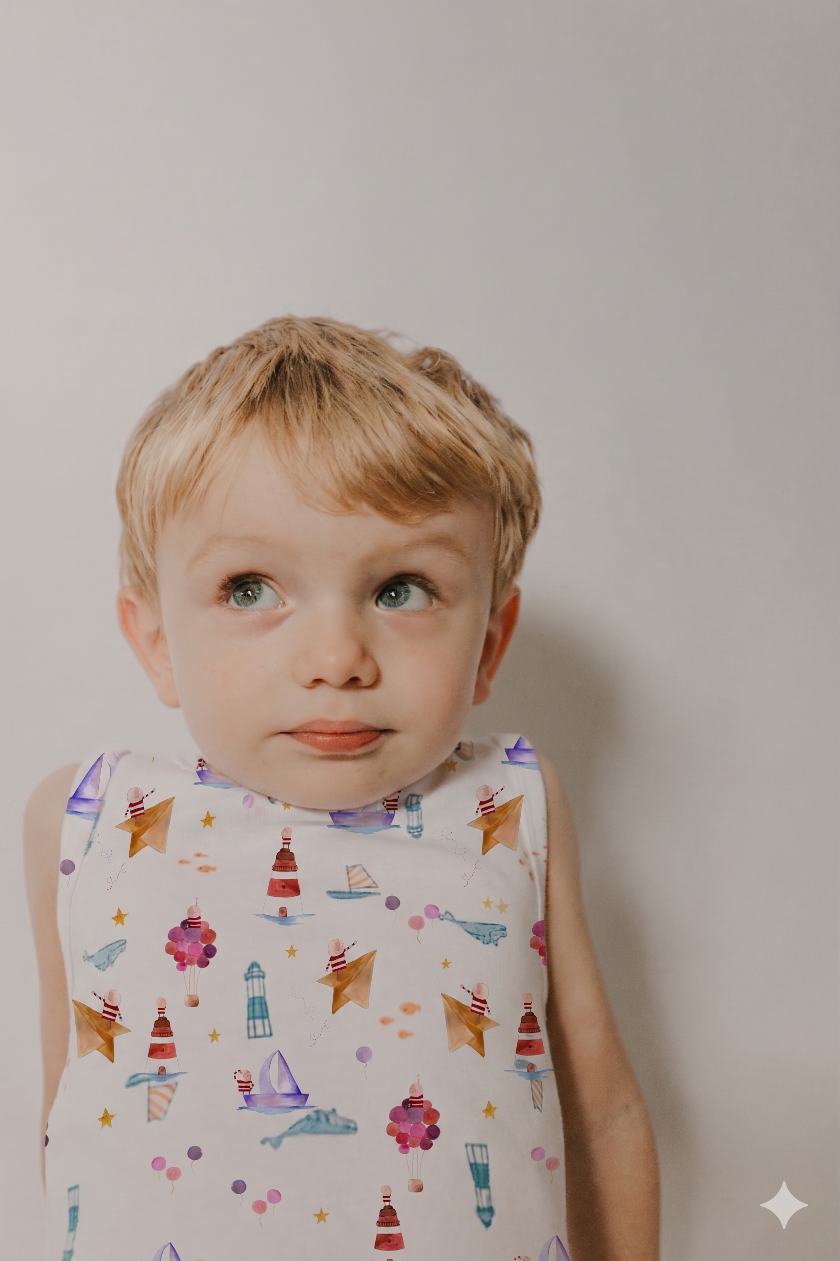
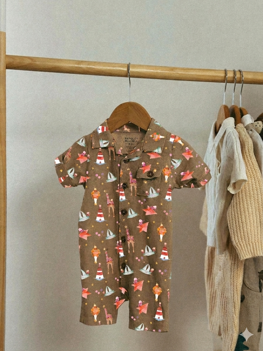
Packaging as part of the experience, not just a container
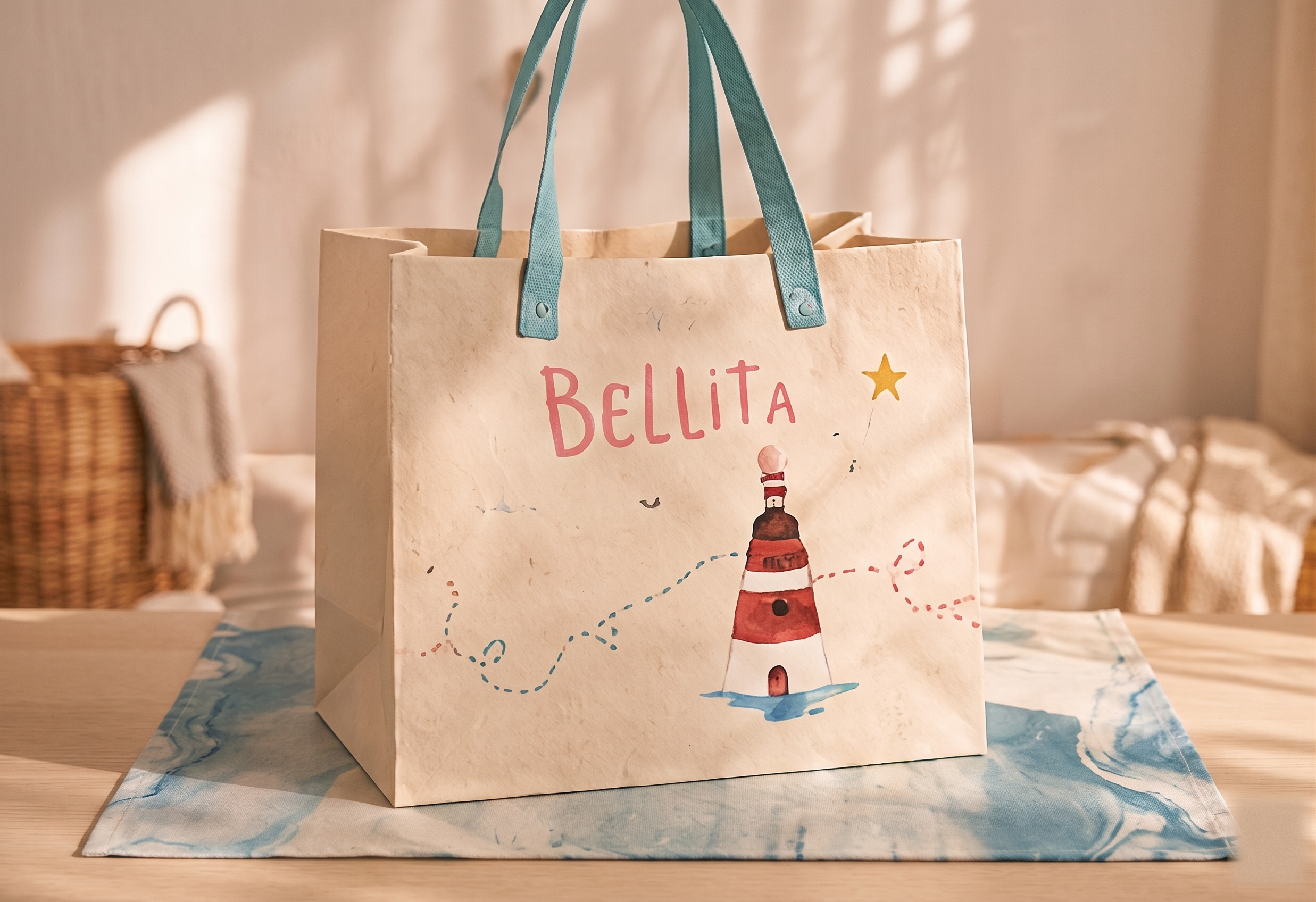
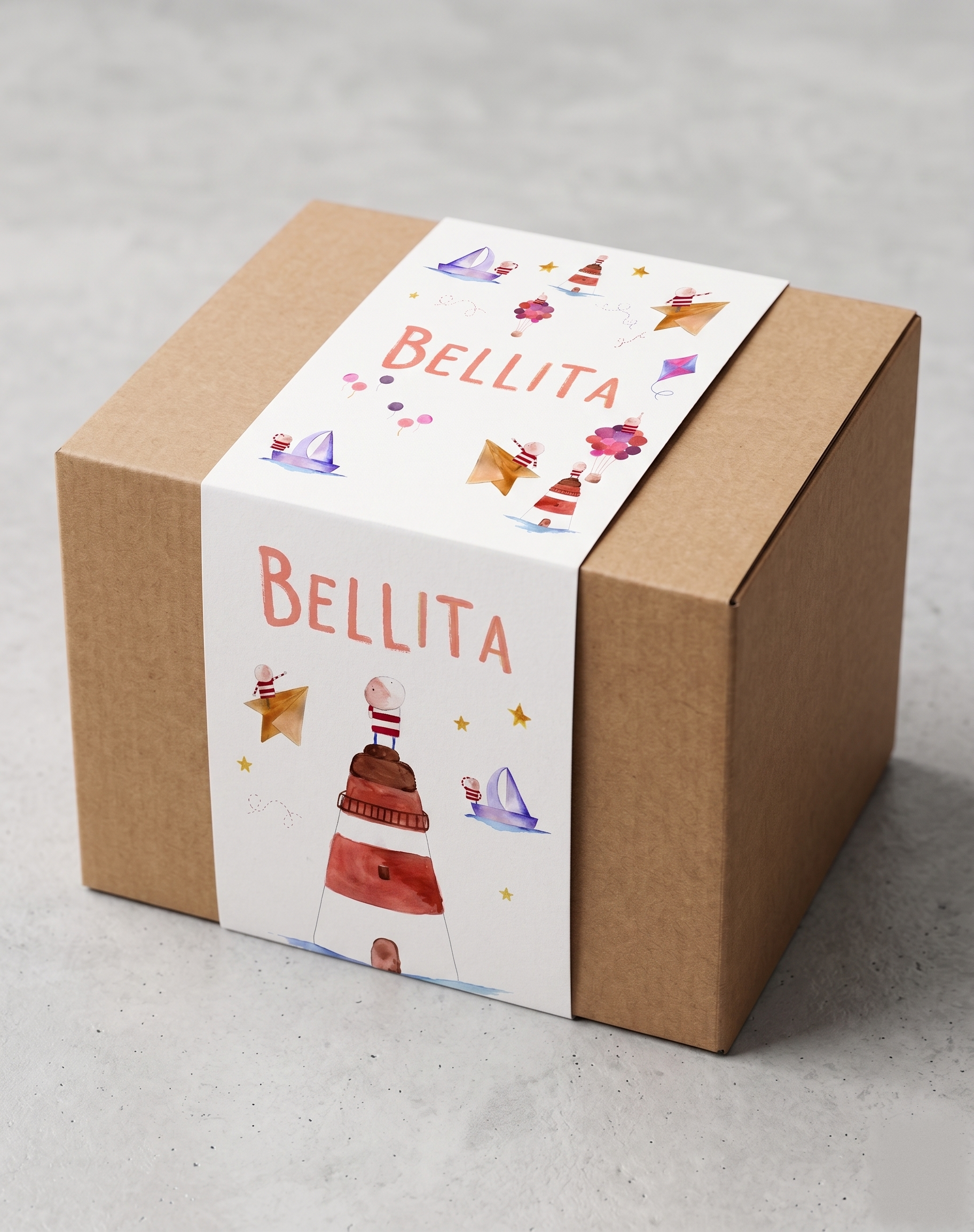
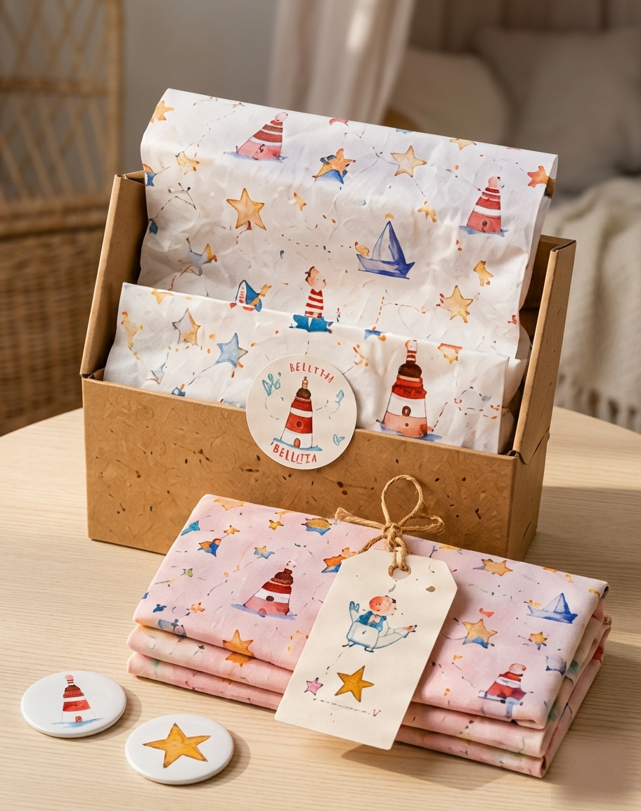
Packaging was conceived as an extension of the brand experience rather than a functional container.
Each piece was designed to continue the spirit of play through illustrations, handmade details and graphic elements consistent with the broader visual universe — every interaction crafted to preserve the creative and artisanal character present throughout the identity.
A space that invites children to create and play
The concept extended into physical space through experiences designed to encourage children to interact, create and play. Activities centered around drawing, painting, hands-on materials and object-making transformed the store into a natural extension of the brand universe.
Play structures and touchpoints that invite children to climb in, hide and create.
“Every touchpoint was designed to reinforce active participation and creative exploration”