Translating a vision into a visual story
Bringing a shared visual concept to life through photography
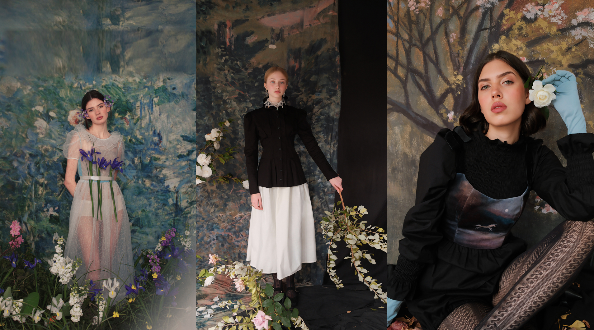
This project began with a shared visual concept inspired by Impressionism: a character somewhere between a nymph and a fairy, emerging from an otherworldly landscape.
As photographer and creative director, I worked alongside the art direction team to translate this concept into a cohesive visual language, exploring light, movement, color and composition across the set, wardrobe and props.
The process became an exploration of how a conceptual idea can take shape through visual decisions, from the atmosphere of the scene to the smallest details within the frame.
collaboration
& Photography
(Creative Direction & Photography)
Visual Concept Development
Final Image Selection
Light · Color · Movement
Adobe Lightroom · Adobe Photoshop
A visual language between painting and fantasy
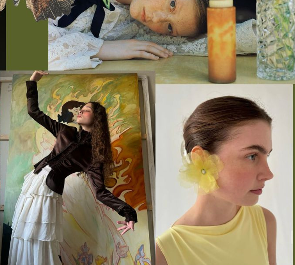
The visual direction was built around the tension between the real and the otherworldly. Drawing from Impressionist landscapes, fantasy characters and contemporary editorial imagery, the moodboard explored a world where the figure could exist somewhere between a woman, a nymph and a fairy.
Painterly backgrounds, organic textures, historical silhouettes and delicate botanical elements created a dreamlike environment, while contrasting tones of white, green and red brought depth and tension to the compositions.
The references guided not only the aesthetic, but the way we approached light, movement, styling and composition, treating each frame almost like a living painting.
Finding the character within the person
The model was chosen for her ability to embody the delicate, otherworldly character we envisioned from the beginning.
Her fair skin, natural curls and delicate features created the ethereal quality we were looking for, while her natural beauty kept the character grounded and believable. Nothing felt overly constructed — her face, body and presence already carried something of the nymph we imagined.
Beyond her appearance, her expression and movement were essential. The softness of her gestures, the way she held her body and the subtlety of her expressions brought a sense of lightness and fluidity to the character.
She wasn't simply cast to represent the character — her natural presence became part of the character itself.
Painting with light
The photographic direction was guided by the same idea that shaped the rest of the production: making the character feel as if she belonged to the painting.
We worked with soft, diffused light and gentle contrast to preserve the delicate quality of the fabrics, skin and painted textures, allowing the background to remain present rather than simply becoming a backdrop.
The camera direction focused on movement, gesture and intimacy. Rather than relying only on posed portraits, we explored fluid body positions, extended gestures and moments of stillness to create images that feel almost like fragments of a larger painting.
We also played with framing and proximity, moving between wider compositions that integrated the character into the landscape and closer portraits that captured her expression and presence.
Styling as part of the landscape
The styling was designed to make the character feel like an extension of the landscape. We worked with translucent fabrics, soft layers and delicate textures to evoke the ethereal quality of a fairy-like character, allowing movement and light to become part of the look.
The main palette of lilac, light blue, green and white was carefully chosen to echo the Impressionist landscapes and allow the model to visually blend into her surroundings. Rather than standing apart from the set, the character could almost dissolve into it.
We then introduced translucent accents of red and touches of yellow through the tul and accessories. These colors echoed the flowers and warmer tones found within the painted backgrounds, creating subtle connections between the styling and the landscape.
What I'd carry into the next one.
Learning
This project gave me the opportunity to put composition, light, posing, styling and visual direction into practice, bringing together the different variables that shape a final image.
A final image is never the result of a single choice. The model, the pose, the wardrobe, the light, the set, the color and the camera all contribute to the same visual story. Each element shapes the way the others are perceived, making the creative process a constant exercise in observation, adjustment and exploration.
Working through these variables in practice continues to strengthen my visual decision-making and gives me more confidence to explore what happens when they interact. It is a process I genuinely enjoy, turning an idea into something tangible through many small, intentional decisions.